

Left Turn at Albuquerque: In Dialogue with David Drummond, Salamander Hill
Facilitated by Kevin Andrew Heslop

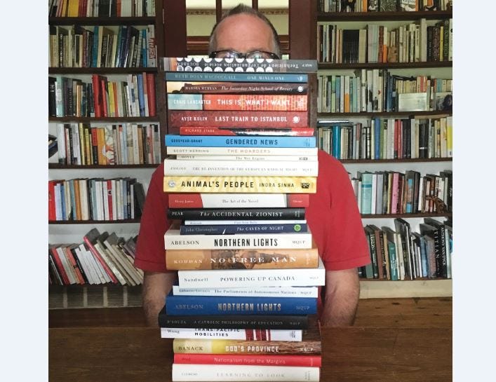
David Drummond is the founder and principal of Salamander Hill Design, based in Elgin, Québec, Canada. Their studio in a 200-year-old stone farmhouse, works on projects that include book covers, packaging, brand identity, and illustration. Their award-winning work has been featured in AIGA (American Institute of Graphics Arts) design competitions, AAUP (American Association of University Presses) Cover and Jackets Competition, Communication Arts Design Annual, and Print magazine’s Regional Design Annual.
What follows is a transcript of our discussion of a variety of subjects including; David’s beginnings, the mystery of the creative process, the visual poem from left field, a thick skin, cliché, and artificial intelligence.
Kevin Andrew Heslop: David, where were you born?
David Drummond: In Minnesota. I grew up in Montréal. My father was in a medical residency in Minnesota—we spent three or four years there—and then we came back to Canada.
So, bilingual primary school education, I guess?
Yep. Québec Anglophone; Montréal Anglophone. It was a bilingual education but—It’s funny because I went to work for a Montreal company – I moved from Toronto back to Quebec; and it was right around the time of the second referendum in 1995. It was one of those sink-or-swim situations. The workplace was entirely french speaking, and I realized my French was not what I thought it was. But it got better.
I know the geography of Montréal a little bit. I wonder whereabouts in town you were.
West end of the city, Montréal West. It’s west of Westmount—very anglophone. It could not be more anglophone, though it’s probably changed now since what it was.
And what do you recall your first interests to have been?
My mother was definitely artistic, I would say, so she would do things with me when I was younger. That’s a memory I have. I spent a lot of time around nature as well: we had a cottage up in the Laurentians, so that was a big part of it too.
Summers up there, sort of thing?
Yep. Yep.
Do you mind if I ask what work your dad was doing that brought you from Minnesota to Montréal?
He was a paediatrician, so he was doing research in paediatrics. He did his residency in Minneapolis and then came back to the Montréal Children’s Hospital, where he spent the rest of his career.
And in addition to maternal labour, did your mom work?
No. She had five kids and was pretty much home. She went to work later on in her life but at that period she was at home with us.
And your first experience of the arts would have been with her.
I would say so. She definitely had that interest, and passed it on to me. It is definitely part of my make-up.
Siblings? Five kids.
Four siblings. Yep.
Are you the black sheep?
*chuckles* Not really. No, I wouldn’t say that.
In what directions did the others go?
My oldest brother is a doctor. Oldest sister is a law professor. I have a twin sister who’s a nurse and a younger brother who’s a carpenter, a timber-frame builder.
How would you characterize your education? You remained in Montréal. Did you go to university there?
I went all the way up through highschool and then my family moved to London for a year. I was going to do my A-levels in science and my father convinced me to do it in art instead. My future took a left turn at Albuquerque from that point on.
At his recommendation.
Yep.
And in favour of the arts rather than the sciences.
Yeah. We were sitting outside the headmaster’s office when I was supposed to choose what my three specialities were going to be; and I was going to walk in and say Physics, Math, and Chemistry. And he said, You know what? Why don’t you just treat this as a chance to do something totally different. That was huge, I think.
Wow.
…
Left turn at Albuquerque in London, England.
Yeah. Then I did a degree in Fine Arts. I would never have done a degree in Fine Arts if that hadn’t happened.
So obviously he was aware of your predisposition towards the arts but you were also obviously competent or even interested in the sciences.
Yeah. I hadn’t given it much thought, I don’t think. I was good in science in highschool and stuff, so I thought it was an automatic decision—just carry on with it. And he suggested pulling it back to try something different.
So you were only in London for one year or did you remain there for school?
Just for one year.
And then where do you go from there?
Then I came back to go to CEGEP in Québec, which is before you go to university. So I did two years of CEGEP and then a degree in Fine Arts in Toronto. Majored in Graphic Design.
Did you begin working expressly in book-cover design during that time in Toronto or did that come a little bit later?
After university I did a year of computer graphics at Sheridan College and my final project for that was a series of book covers. I definitely had an interest in it. Then I went into corporate graphic design in Toronto and then came to Montréal and again worked in corporate communications. It was my sister who was having a book published at McGill-Queen’s University, which, funnily enough, was just down the street from where I was working. She suggested that I do the cover; and years later—they became a client of mine—I spoke to my sister’s contact at the press and she said, You’ll never believe how many requests I get from authors to have their sisters or brothers or they have a friend who’s an artist do the cover design.
*chuckling*
So she figured she would give it a shot and she called me. And I was actually just about to go into a presentation for Provigo—a big grocery store chain in Québec—I was doing package-design for them; and I was sitting in there waiting and McGill-Queen’s University Press—that’s the publisher of my sister’s book—called me and she said, We’d be interested in having you come by. And I almost sort of blew them off because I was like, Do I really want to do this? It didn’t seem like it was a serious thing for a graphic designer. But boy was I wrong. So that was the very first book cover I ever did. And they’ve become a great client. We’ve had a really good run.
You’d mentioned the series of book covers that you’d made for your thesis in school. I wonder if you’d say a few words about the series. Were they connected?
Nope, they were just classics. There was an F. Scott F—The Great Gatsby I did. The Heart is a Lonely Hunter. Death in Venice. But they were all done using what were at the time very sophisticated computer graphics machines, which totally got replaced by the Macintosh. So it was amazing trying to use that technology to create book covers and push boundaries a little bit, because that’s not really what those machines were designed to do, to do serious graphic design. I still have those covers, matted on presentation.

How did you select the titles?
*laughs* I think they were just my favourite books.
Yeah.
Yeah. It was just kind of … There were about ten of them, I think.
Hm.
With each one I was trying to sort of push the boundaries a little bit, in terms of what the computers could do.
Given that they were your favourite books, you were obviously familiar with all of them, but I don’t know if it’s even possible for that process to have carried on with subsequent covers that you’ve designed. How familiar are you with the texts before you create their covers?
I get that question a lot, actually. My father, who’s no longer living, had Alzheimer’s; and because he was a professor of medicine—so scholarly books were of interest to him—he always asked me that. How do you design the cover? You don’t have time to read all the books, obviously, right?
Mhm.
Especially for scholarly books. It’s not really feasible. But that was his question. He kept coming back to it. How can you design a book cover for a book you haven’t read? Which is, admittedly, not a bad question *laughs*.
But that’s not the case with poetry or with fiction, where I read as much of the manuscript as possible. I have access to the editor and the author if I need it and a lot of material to go over, so you’re doing it from an informed place. That’s the idea.
Mhm. Well, if I may propose a belated rejoinder, How can you name a person you haven’t met, Dad?
*laughs* Yes.
*laughs*
It’s crazy because he—That was a question he would keep coming back to, even when everything else fell away.
Mm.
He was very interested in what I was doing but he didn’t understand it. He didn’t understand how the process works. How do you come up with an idea for a cover, especially for something that’s a scholarly work, where the ideas can be hard to convey visually.
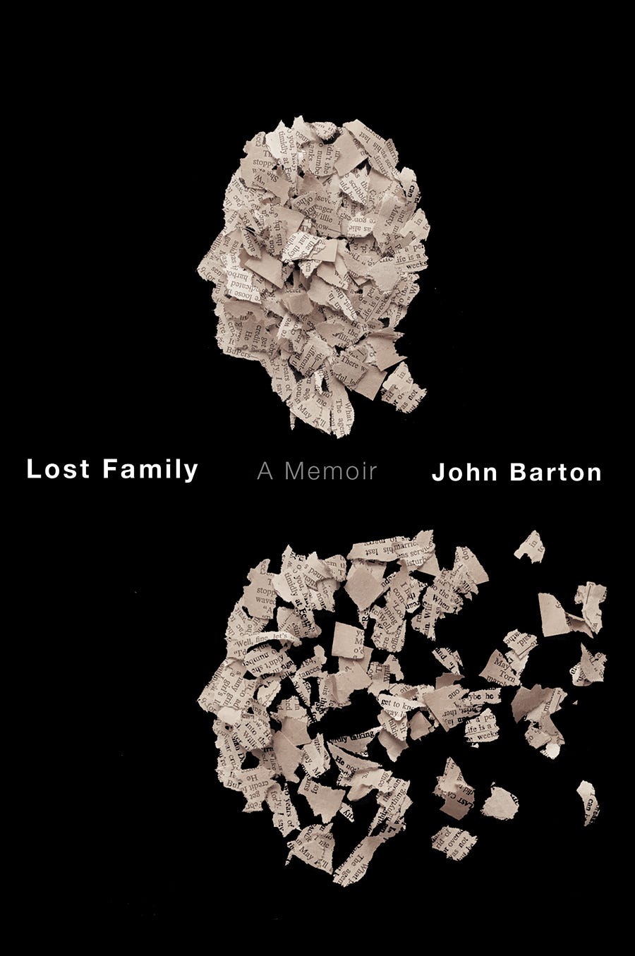
Well, we’ll only get into this as far as you’re comfortable, but I haven’t known anyone personally who has had Alzheimer’s. But I’m looking at the cover for John Barton’s Lost Family—
It’s very interesting you’re saying that. That’s very—Because I did that around the time that he died. And I can’t say that I wasn’t thinking about that. Because it is sort of like that. Those poems are not really about so much about a disease or Alzheimer’s or losing your memory, but that experience definitely informed that cover, I would say.
Again, not having personal experience with Alzheimer’s, I guess it’s a theme that for people who have that disease, some things will remain—like that recurrent question.
Yeah. Absolutely. He grew up near the Drummond dairy farm in the east end of Montréal; and at this point was very fixated on his grandfather. There was a school named after him, Drummond school in Rosemount. He had this idea that his grandfather donated milk to the school children. This was in the 1920s and 30s. And I don’t believe that actually happened but that’s something he kept coming back to.
My mother’s sort of going through it now with dementia as well. You sort of run with it. They might start talking about something, even if it could be kind of something that they’ve imagined, almost like they are conflating dreams with reality. You’re not sure if it’s a dream or real. But I would just go with that milk story, when talking with my father.
Mm.
He would talk about it in a way that made it seem to have been an act of kindness that his grandfather had done.
I mean, you take on the improviser’s injunction of “Yes and.”
Yeah. That’s right. Whereas a lot of people try and correct them or ask them trivial questions they’re not really interested in about their past. It wouldn’t have made any sense to talk to my father about his medical career because he had forgotten it all and it would have caused pain, I think.
Mm.
You sort of get into these very kind of—*laughing* interesting conversations, I would say.
Inventive, yeah?
Yeah, yeah. Yeah. Yeah—Yeah.
Well, thinking about that cover particularly, Lost Family, it just strikes me as so potently emotional an image. And I could imagine that people might misperceive the work that you do as not being deeply emotional but I can’t help but infer really strong emotion in all of these covers, informed by the work behind the cover, the writing, but also from your own practice. And I wonder if you’d talk a little bit about that.
I think you can’t help it. You put yourself into it, even your own life story, into these covers. I don’t think the authors are always aware of it. There’s another cover I did that has a similar sort of idea. I was going through my father’s slide collection after he died; and he would always mark his slides with a diagonal line. He showed his slides in carousels and it mattered what direction you put the slide in.
Mm.
So I used that on a poetry cover—
Ah.
—Where the image inside the slide was sort of melting away, as if a lightbulb had overheated it.
Wow.
I never told anybody that it is my father’s mark on that Kodak slide. The poet probably wasn’t aware of it. Nobody questioned it. But it means something to me. It has resonance to me. But I do that all the time. I think most cover designers would tell you that too. You pull from what you have, from your own experience, touchstones.
Something that keeps coming back for me is a line that Joyce was reputed to have said, which was something like, If you describe the intersection in your hometown with sufficient precision, then it will be universally recognizable as the—
Ah.
—Intersection of the hometown of anybody who reads the description. And I wonder if part of including that faded red mark in the upper right-hand corner of the cover as you’ve described it, which is then just not even questioned, that there’s something—There’s something there where you almost touch on some kind of universal sensibility.
Maybe to phrase this as a question, there is a way that, as an image-designer, if that’s how you think of yourself, you’re engaging with a kind of—I don’t want to say collective unconscious because that sounds like it has too much pseudo-Jungian baggage, but—a kind of universality. The work can be both universal and deeply personal. Does that resonate at all?
Yep. And I think especially for poetry covers. I see these covers as visual poems. And they’re ambiguous in the same kind of way as poetry is: it’s not all spelled out. That’s definitely what I’m working with or what I’m trying to do. And I’ve done so many poetry covers. I’ve totally lost count, but a lot for Véhicule Press, a lot for McGill-Queen’s. And the great thing is that I have these relationships with these presses where they’ve let me do that kind of stuff. When you’re working with a client, you sort of both have to be fighting the same battle; and if you’re not, that’s when things go off the rails. If I’m trying to create something like a visual poem but the client doesn’t want that—they want something more commercial, less obtuse—then we’re not fighting the same battle. But with those two presses, I totally feel that we are in battle together, that they want to engage with me in that way. Let’s see. I’m trying to actually find—Go on, sorry.
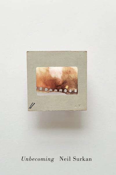
No, please, please. Take your time. I mean, I’d love to include an image of that particular cover with the red mark in the upper right in the final version of this.
Yep. I’ll just keep scrolling through. Sorry.
No, please, take your time.
Part of the problem is that I’ve done so many covers that I can’t—I have the image but I don’t *laughing* have the title.
It’s okay.
You haven’t published a book, have you?
I have, yes. My first full-length came out in 2021.
Oh, who published that?
Gordon Hill Press.
Okay.
…
And because we’re speaking of covers, were you happy with your cover?
I was, yeah. It was a process. I reached out to a couple—
How did you find the process?
The process was one of … self-indulgent introspection followed by the publisher saying, Okay, we need something next week. How’s this?
*laughing*
And I was like, Okay. Well, how about this as an idea?
Did you feel like you could have a lot of input?
Completely. In every respect with that book, actually. I more or less typeset the book myself. And disregarded many of the proofreader’s *chuckling* suggestions.
Did you ever consider doing your own cover?
I didn’t. I thought I’d put it in the hands of more capable artists than I. So I reached out originally to a couple of artist-friends who designed ideas, but neither of them worked; and then we ended up going with an image of text situated where I wanted it and the colour that I wanted and then my publisher came up with a digital image that matched the book’s title.
Huh.
Yeah.
There we go. So that’s—It’s called Unbecoming by Neil Surtan.
Unbecoming. Ah.
It’s a book of poetry. The mark is in the lower left-hand side.
Okay. Is that where they were correspondingly on the slides?
Yep.
Okay, the lower left.
My father was so—That was so much his personality. He would mark every single slide. He documented everything.
I mean, the contrast between that level of precision and meticulousness and Alzheimer’s must have been really striking.
Yes. And actually he was such a brilliant doctor that it was kind of—It wasn’t clear to us what was happening until it was already quite progressed.
Right.
He was very good at compensating.
Right, right.
Very brilliant doctor, for sure. And actually he was laser-focussed on one thing his whole career. He didn’t understand how to watch a movie or read a book. He couldn’t—If you were watching a film with him, he would keep asking questions about the plot and stuff. But he was laser-focussed on childhood nephrology, kidney disease in children. And that was his entire career.
Well, I mean, hat’s off to him for encouraging that turn at Albuquerque.
Left turn at Albuquerque. You know where that comes from, eh?
I don’t, actually, catch the reference.
That’s from Bugs Bunny.
Okay.
Because Bugs Bunny’s head pops out of a hole at the beginning of the cartoon and he pulls out a map to see where he is and he realizes he took a left turn at Albuquerque. Or, a wrong turn at Albuquerque.
That sounds to me like the title of this but we’ll see.
*chuckling* It could be, actually.
So, particularly for poetry covers, there’s maybe more liberty to be oblique or evocative—
That’s the word I was looking for. Yep. Yep. Yes.
—As opposed to Long Live Latin, for instance, which is obviously non-fiction; and it’s much more direct. So do you find that there’s a correlation between the genre and the genre of the image that accompanies it?
Well, for all of my book covers, I try to give them a sort of visual intelligence, so you interact with them. Even if it’s a non-fiction book, I aim for that. You can’t always achieve this on every cover. If you’re doing a non-fiction book, sometimes you have to be very direct. But Long Live Latin, that one was a challenge. For those kinds of books it’s always a challenge. How do you present this in a way that’s original and interesting? So in this case the visual problem that has to be solved is how do you show that the language is still vibrant and alive?
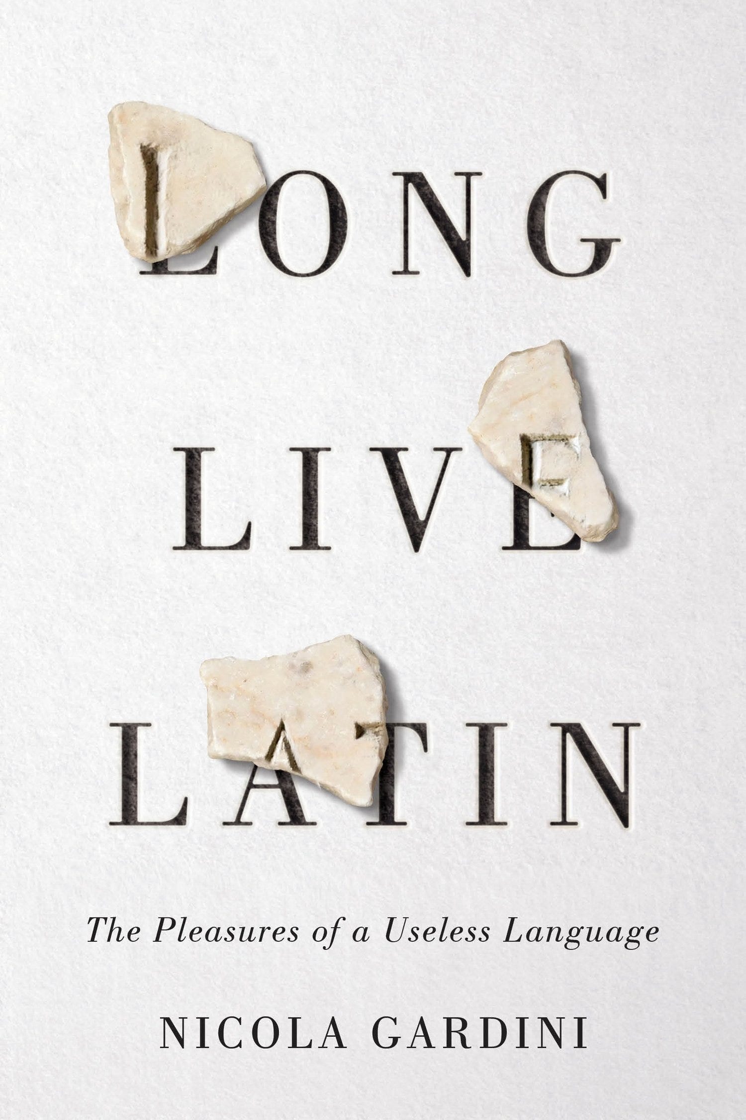
Mm.
You don’t usually just present one cover, so there were other options. This was a cover for FSG in New York. The art director came to me and they knew what my work was like and they wanted that kind of an approach. So they weren’t asking me just to do a straight-up book cover. They were saying, We like what you’ve done with this book, or this cover, and we’d like a similar treatment. So that’s an example where you are fighting the same battle. You’re not worried you’re going to present something to them and they’re going to go, What the heck is this? What was he thinking *chuckles*? And you do get that reaction sometimes. And I don’t mind that, so much. But I’m sure it sometimes arrives on somebody’s desk and they show it at a meeting and it’s kind of like, What the hell is this?
Yeah.
It sounds kind of cliché but you have to be prepared to fail. Sometimes you aim for the bleachers and miss. My boss at the French company I worked at in Montréal, he always set the bar very high. He wanted to be surprised every time. And that’s stayed with me my whole career. You want to challenge yourself. And I think you were asking me before about living where I live?
Mhm.
In the written questions you were asking me that. I sort of see book-cover design, or any kind of graphic design, actually, as trying to solve a visual problem. You have to present it to yourself. It’s like presenting it to your brain. How can I do a cover for a book on Latin that’s going to be interesting and unusual and that’s going to say something new? And then I put it aside. I live on this farm and I’ll just leave it there in the back of my mind, kind of—
Mm.
—And go for a walk or walk my dogs or whatever. It’s not like you’re working still but it’s sort of percolating.
Mhm.
For me that’s a key part of the process. It really is like a visual problem. I can’t tell you how many book covers I’ve done about the Supreme Court in Canada or multi-racialism in Canada or federalism in Canada or the Québec-Canada issue. I’ve done a ton of covers about that. And every time it’s like, How can I do this? How can I say something new?
Mm.
That’s always the challenge.
Which is in step with your ambition with that original suite of covers from school when you were challenging what could be possible with the software you were using.
Yeah. Yep.
How to push the boundary.
Yeah. There’s a brilliant—It’s often referenced by graphic designers, but there’s a really good book called A Smile in the Mind by Beryl McAlhone and David Stuart. It’s a book about graphic design. That’s what I’m striving for. When you see it you kind of go, Ah! If I had to name the company again, I might have called it Mind Smile. Something like that. Because that’s what you want. You want people to engage with it a little bit. They don’t have a lot of time when they’re buying a book, obviously, but to engage a little bit. Make them stop and think.
Mm. Is there a consistency to the length of the interval between when you first consider coming up with a cover for a book like Long Live Latin and when, as a result of walking the dogs or walking in the woods in Elgin, the image comes? Does it take four days, two weeks, three months?
It’s hard to say. It’s a very mysterious process. I don’t totally understand it, to be honest. People ask me that quite often. How did you get that idea?
*laughing* The oldest question for artists in the book. Where do your ideas come from?
I find for non-fiction books about a subject like the supreme court, for example, it is hard not to resort to common visual tropes. you keep going back to the well and you hope that there’s something there. And so far there has been. But again, I find there is something mysterious about it.
I can’t imagine how many covers of books of the kind you just described having to do with American history just have the Lincoln memorial on the front.
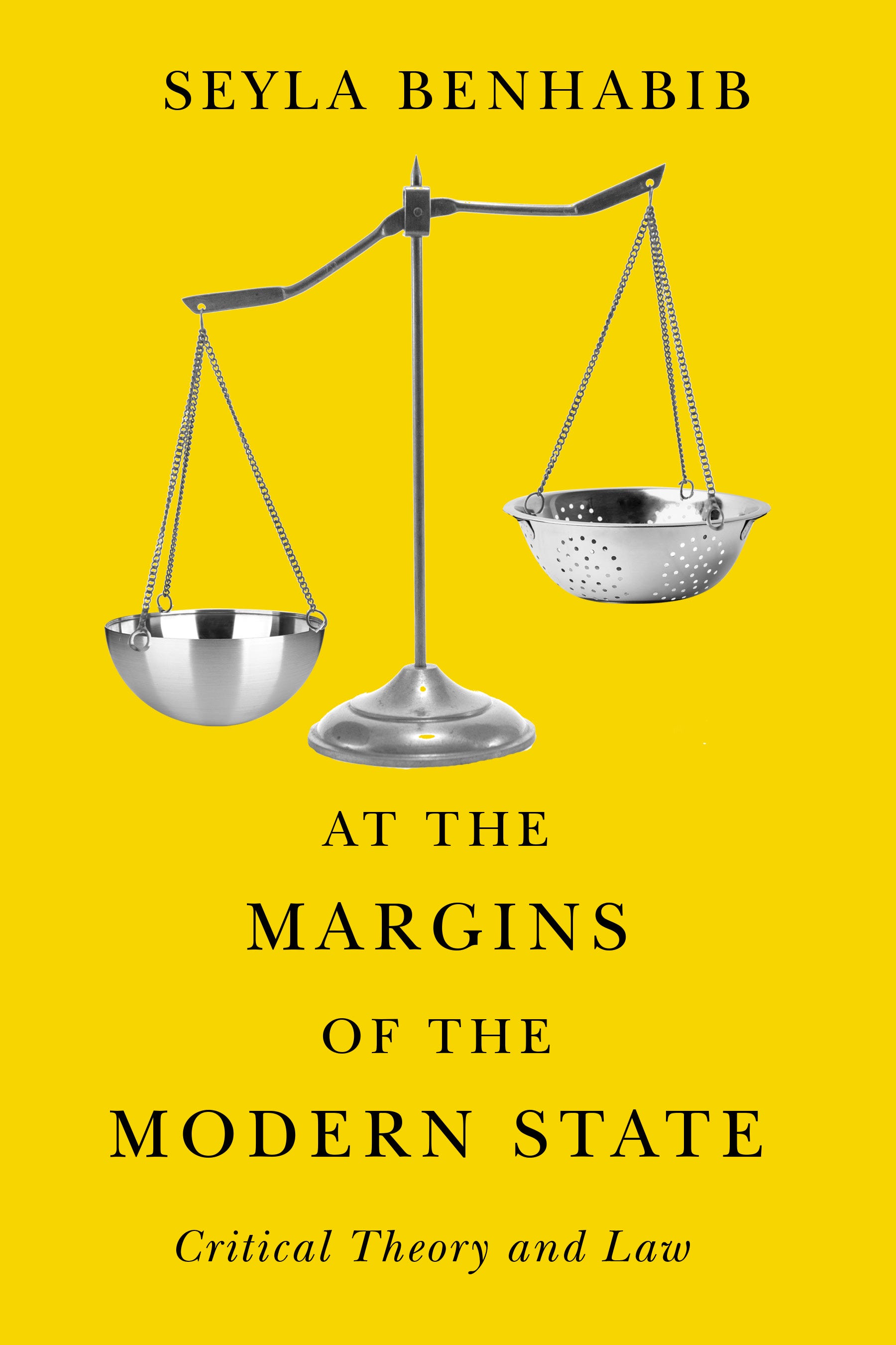
Well, I actually just did a cover for a British publisher—I can’t even tell you how many times this happens—that involves injustice in the world. And it’s gotta be hundreds of times that the scales of justice has been suggested to me as a possible cover image. But how can you possibly use the scales of justice in a new or unusual way? Or the Canadian flag? Or a map? Authors often ask, Could we put a map on the cover with a flag superimposed. And then you sort of go, Right. But the thing is, how do you manage to find something new in that? And actually, for this cover with the scales of justice I did *laughing*.
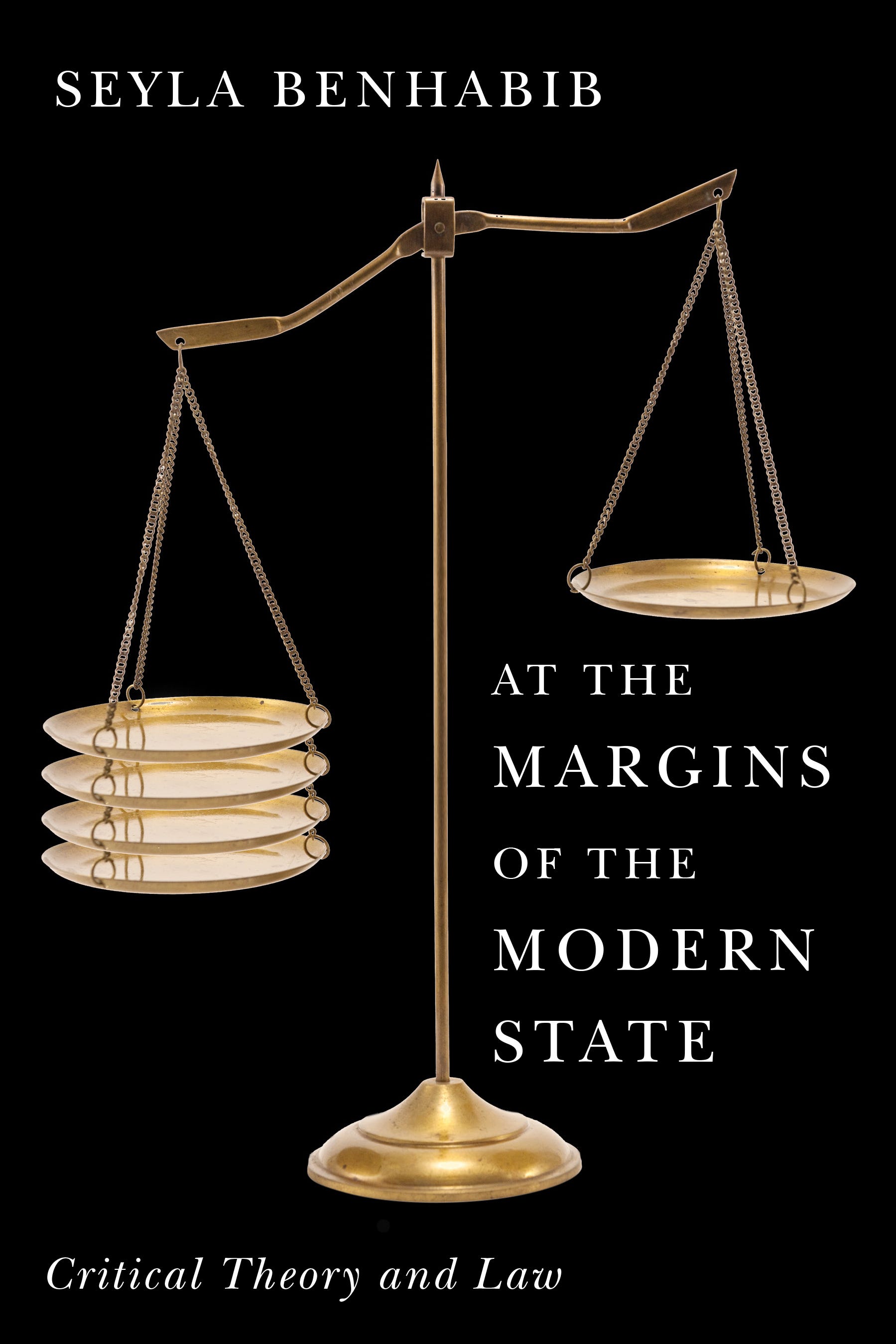
It’s a kind of challenge, actually. You sort of say, Is there a way to do something new here or not? And for poetry covers, a lot of poets want a work of art on the cover. Either they have a family member who’s an artist or they have a favourite painting. That happens a lot. So when I come back with something out of left field when they’re expecting a painting or something similar on the cover and I come back with this slide image that I was referring to before. You can imagine it’s kind of like, What? But for the most part it works out.
When the images come, do they come with fonts?
How do you mean?
I mean, when you see—
Oh, no. It’s always image first.
Image first.
Yeah. Fonts are really, really important. At one point I said in an interview that I didn’t tend to use that many fonts on my book covers. I’ve been on juries for design competitions and I’m always looking for designers that use conceptual thinking and don’t get totally distracted by just choosing the current or trendy font. So in this interview I had said how important I thought the image or the concept was and maybe the font was secondary. I wouldn’t say that now because the choice of typeface is a big part of it, for sure. And you can get really creative with type, too. Do you know Peter Mendelsund?
Mm-mm, no.
He’s a book-cover designer. He did a whole series of Kafka covers. He’s done covers for books that are in your library for sure. He worked at Random House in New York, and then he became an author himself—he’s a published author now. I heard him interviewed once, and he was asked about the choice of font for a cover. It’s very hard to say why one font works and another one doesn’t. You do play around with it a lot. It’s gotta hit the right note. But the way I work, definitely the image comes first. It’s not so much the image; it’s the concept. The concept comes first.
On the topic of suggestions from publishers or authors, I was thinking about Jerry Seinfeld talking about the importance of not having producers on set, and how—
Ha!
—Executive Producers tend not ever to be able to come up with comedic ideas. If they could, they would be comedians; they’re not; they’re producers.
That’s right. It’s funny because Larry David also says he would get these notes for changes to the script from the higher ups at NBC and he would just say no. They’d be making suggestions and you just say, No, we’re not going to do that. Here’s what happens: you present the first round of covers and because you’re not there for the presentation—so you’re dealing with marketing people, the editors, and the publisher—and they’re going through your ideas and you get the feedback afterwards. That can be kind of brutal and you have to have a thick skin because you have to be able to let it go. If you’ve done something you thought was really kind of perfect for the book and they didn’t get it or thought it was wrong for the book. You have to be able to take their criticism. You can’t be Larry David. You can’t say no *laughing*. You won’t last long.
My image of Larry David is that he would quit every third day on Seinfeld.
Yeah, yeah.
I’m not doing this! I can’t do this! I can’t work under these conditions! I’m not going to—!
It’s like running the gauntlet. You launch—My brother is a poet and he said, Writing a poem is like throwing a pebble into the Grand Canyon and waiting for a sound when it hits the bottom. You launch these book covers out there; you don’t hear for a while; and then it comes back. Or it runs the gauntlet and everyone at the press loves it and the author’s dead set against it.
Mm.
So that’s the challenging part, is you have to be able to pivot and start again or take the feedback and then interpret it and come back. You can’t—It’s not your book. You get very invested in it, but obviously it’s not your book.
Yeah.
You have to adjust. It’s not always easy because it can be kind of brutal. They can just hate it. They can really just hate what you did and it’s like, Ugh. In the beginning, I worked for a lot of small presses and then I started getting covers for the big trade publishers in New York and they don’t sugarcoat it. If it’s not working, they’re gonna just say, This is just absolutely not right. Do you have anything else?
*chuckles*
And earlier on I was kind of devastated by that. I was like, Oh my god! How do I keep going? They said they don’t like my work.
Mhm.
Thick skin.
I’m thinking about actors, for instance, who would have a similar response if they were auditioning for a part and a casting director says, Have you got anything else? No, it’s me.
*chuckles*
This is me. I don’t have anything else.
Well it’s like what I said before about how much of yourself you put into this kind of stuff. Like that slide image I was telling you about. And then for that kind of reaction to come back, it’s very hard not to take it personally. You really have to pick yourself up. You can’t let it affect your confidence. When you’re younger, it’s much harder. When you’re just starting out you sort of start questioning your abilities.
Taking rejection personally.
Yep. Because the problem is you’re asked to be creative on the spot. Come up with something else. We want another idea for this. And sometimes it isn’t obvious how to proceed. You can’t just take three weeks off and say I’m just going to put this aside and come back to it. It’s like, Here we go. And that’s the mysterious part. Faced with that, how you go away and come back with something that you’re still really happy with, or that you think is still really interesting and original.
I mean, the image that’s coming to mind is of dropping a pail down into a well that’s so deep that it darkens before you can see the water in it and just having faith that when you bring it back up after it’s touched water that it’ll be full.
Yeah.
And I imagine that in a boardroom context that creative process is alien.
Yep. Because you’re not there to talk about your work, either. You’re depending on somebody else to explain it or present it. I mentioned Peter Mendelsund. There’s another designer in New York, Chip Kidd. He had a relationship with the guy who used to run Random House, Sunny Meta. Kidd would just walk into his office and say, This is what I wanna do. And Meta would say, Okay, let’s do it—so there was nobody else who could put in their two cents or water it down or anything. But that’s rare. That was a relationship between publisher and designer that is not often replicated. You sort of launch it out there and you sort of wait and hope. I think there are cases where you could make an argument and say, I know marketing wants to do this with this book but I think this would be more interesting. But you’re not there to make that argument.
And I feel like there’s way that if you’re presenting an image, if you had to accompany that image with an argument, then you’d almost be defeating yourself because the image itself should be the argument, you know?
That’s very smart. That’s exactly right. If they don’t get it, they don’t get it. You might think it’s brilliant and it hits the mark but that’s why you have to accept defeat. And actually I tell this to designers who are just starting out: it’s great that you did that cover that didn’t get accepted because you learn from it. It might not see the light of day but it’s not a wasted experience. You challenged—You pushed yourself and created something.
Mm. That sounds like Vonnegut. I’ve heard him say something similar. Write a poem and set it on fire because you will have made something.
Yeah. That’s the nice thing about social media is you can tell a story about it after the fact. You can show it. I do that a lot. Once the book has come out—And you don’t sort of say, They made a huge mistake. They should have gone for this.
*laughs*
I call it my Salon des Refusés. They were artists who were rejected from mainstream galleries in Paris so they started their own salon. My rejected covers are my Salon des Réfusés.
Lovely. That sounds like a book.
It’s not a book cover because it wasn’t ever actually printed, so that’s not what it is, but it is an idea.
I mean I could imagine a book so-titled containing those refused images.
Every designer has one. Some covers I’ve gone through twenty rounds and we finally get there but that’s part of the process.
Well, speaking of the process, I wonder about the extent to which it’s standard. Do you have an unlimited iteration clause or something for these contracts?
I find young people are very focussed on getting paid for all their work, which is understandable and it’s important. But presses have a set budget for a book cover. And sometimes you hit it out of the park. You go one round and that’s it. Sometimes you go ten rounds. As I said, this cover went twenty rounds. But you can’t sort of say, After round five I’m going to start to charge you by the hour. That’s not going to work.
There are limits. A book shouldn’t go for twenty rounds, for sure. There are obviously cases where we have to increase the budget a bit, but you’re sort of in it for the budget. It takes however long it takes. Sometimes the publisher will pull the plug and offer a kill fee, which is usually half your fee. And you walk away. I hate that. I’d much rather they say, Look, it’s not working. And sometimes they say that. Do you want to keep going? But a Kill Fee is the worst feeling. It happens quite frequently actually with the big publishing houses. There’s a cover designer I really admire in England. The title of one of his lectures on cover design was, How I Learned to Stop Worrying and Accept the Kill Fee. Because you can take the Kill Fee as a defeat. Or they didn’t think you were any good. But the cover can be rejected for any number of reasons.
Well, it’s a rejection not only of the work that you’ve done but what they imagine you could do. They say, Not only what you’ve done is no good, but we don’t think that you can do anything that we want.
Yeah.
That’s hard.
Yep.
I’m thinking of another acting analogy. In film, an actor signs up to play a scene and they might hit it out of the park on the first or second take, but if it takes twenty takes, they’re not going to get paid less or more.
Yeah, if you worked on a Stanley Kubrick film, then it’s going to be a lot of takes.
Triple digits. You’d mentioned the phrase, It’s not your book. The importance of avoiding attachment to any particular design. And I was thinking about a conversation I had with a Brazilian art curator, Simon Watson, who described his role as a kind of doula, that he would facilitate the artist’s work being installed in a space and that after the process, the artist would embrace the way that the art was curated and they would almost, in Simon’s word, Oedipally kill him off and say, You’re no longer necessary. Now this is mine.
That’s very interesting because I do think about that. The poet or the author is promoting the book with your book cover on it. But it’s theirs.
Right.
That’s what you mean, right?
Yeah.
And it’s kind of like … I’m sure most people think it’s just their cover; they did it themselves; or they’re responsible for it. They don’t think that there’s somebody in the background toiling away *laughing*.
Yeah.
Paul Sahre is another cover designer in New York. He said, Being a famous book cover designer is like being a famous plumber. It’s kind of like that. You’re there in service of the book. And then once your part is done, you step aside.
I’m thinking—again to intrude a film-acting metaphor—the screenwriter William Goldman said that if an actor, instead of picking up a glass of water, decides to pick up a can of coke, suddenly they’ve written the scene.
*laughing* Yeah. But often, especially with poetry covers, in the acknowledgements they will acknowledge the cover-designer, saying, Thank you to so-and-so for doing this. I love my cover. And authors will reach out to you. So it’s not that it’s not appreciated, it’s just that it’s in the background.
What about process? Can you walk me through from beginning to end an average process for a cover design?
You get the brief. You can ask questions and you can ask for the manuscript. Usually it’s about a two-to-three-week period where they want to see the first round or first covers. I tend to—as I say—present the cover as a visual probem. You’re trying to express this in an interesting and an intelligent way. I put it aside and then usually—There are design reference sites with just image after image of graphic design, some of it well-known, some not so much. I tend to bombard my cerebral cortex with image after image just to see what could trigger an idea. Just before I got on the call, I was doing a cover for a novel about a motorcycle gang. So the challenge is, How do I show that in a way that’s not predictable? So it doesn’t look like a Hell’s Angels cover or something like that. So I start looking at images and then something will spark. Oh, that could be an interesting way to do it. I usually have a notepad where I’ll write it down. After that point I’ll leave it and I’ll go on to another one. Luckily I work on a lot of covers so I jump around a lot. I’ll go from a cover like that to a cover for a French book about the Catholic church in Québec. I’ll work on that for a bit and then jump to another one.
Mm.
It’s kind of like keeping your brain occupied or stimulated; and then after I’ve written down those notes from that first bombarding of images, then I’ll start putting it together. Sometimes what I thought was a great idea was a terrible idea and doesn’t work. I said this once to somebody that I’ll keep working on an idea until it stops looking cheesy. Sometimes you think an idea’s really great and you realize, Oh my god this looks really hackneyed or clichéd. Sometimes I’ll just keep at it, keep at it, and I can get it to the point where it’s becoming something interesting. And also you can get to a point where you realize, This isn’t working. Pitch it and start again. And that’s pretty much it. And then you mock that up and make it look as good as you can for the first presentation and then send it off. You’re always in a process of sending things out and waiting for it to come back. In terms of work-flow, it’s very challenging to manage it because things come back a month later and then they say, We’re ready to approve it and go to press. Here’s the back cover copy and the author photo; we need it for next week. Or they want changes or the concept or new concepts. So that’s always happening. That’s constantly happening.
But if you have the initial concept, the cover itself, then you can do the back as a kind of extension of that fairly easily, I would imagine.
Yep. But it’s still a—You have to put all the text and copy on and stuff. That’s a couple of hours, to do that. And then you launch that back out and you wait for them to come back with changes. It’s very kind of … You’re constantly dealing with incoming stuff.
Right.
And I tend to be very busy. I do work on a lot of covers because I like that. I almost never say no. There is a press in Turkey that is now one of my favourite clients. When he first reached out to me, he said, I only have a small budget for my cover designs. I initially thought, Wait a second. That’s the lowest I’ve ever been paid for a book cover; but we developed this great relationship. I just love working with him. He’s another one of these people that really wants me to challenge myself. I’ll give him something sometimes and he’ll say, We like it. It could work. But we were hoping for something stronger.
Mm.
As with many of my clients, we have developed a really nice working relationship. I just did a cover for him for the Turkish translation of Richard Ford’s novel, Canada. He loved it. The back of my farm is the American border. And there are border markings like I used on that cover. That is a border marking to the US border. Can you see the cover?
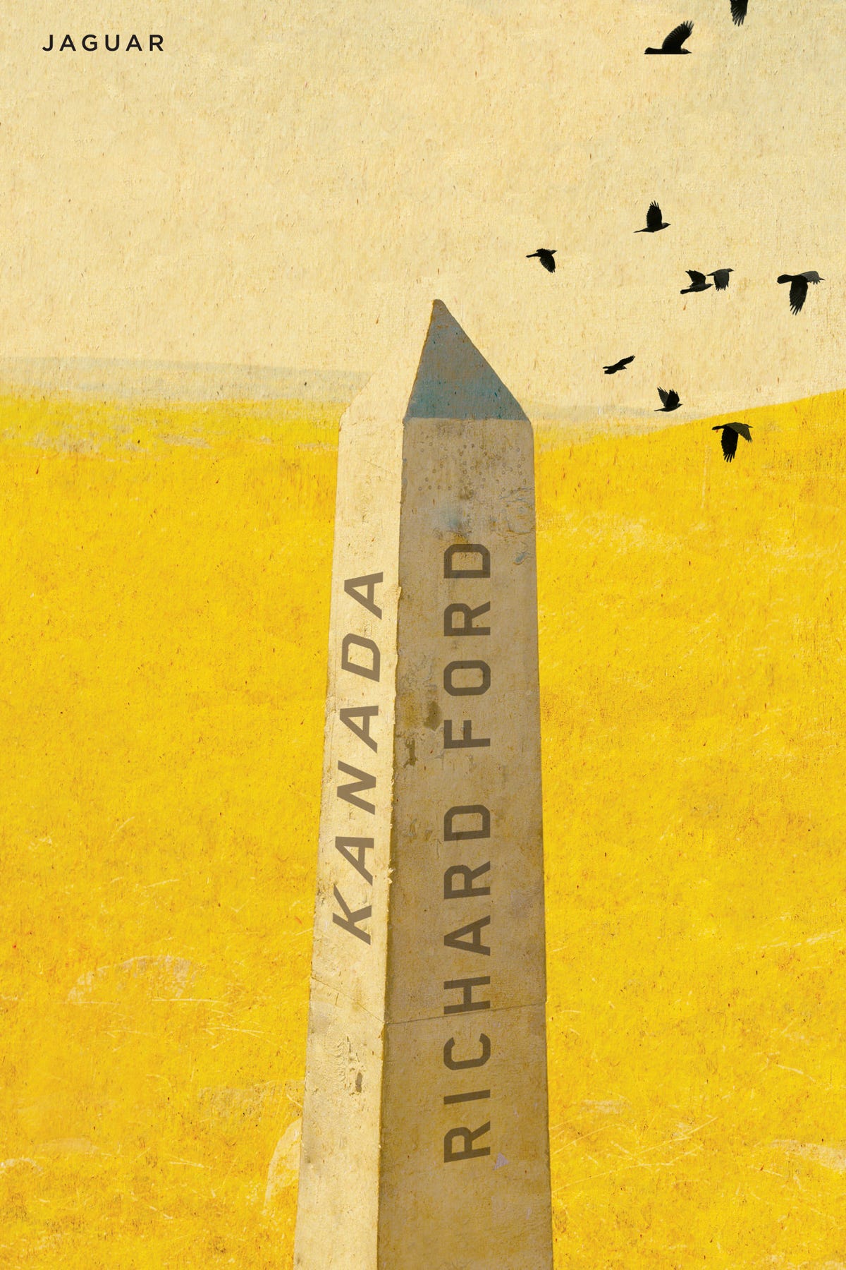
Those are the border markings that are on the border right just south of me here.
Huh.
And I think I presented another idea to him and he said, We like it but can you try something else? And he was totally right. He’s got a very good eye.
The image that was coming to mind when you were describing communicating with various publishers at different stages of the design process was of an octopus with its hands full of badminton racquets in the middle—
*laughing*
—Of an octagon playing simultaneous games of badminton at the baseline of eight different courts.
That’s very apropos. Various clients have said to me that they appreciate my patience with what can be a trying process. Because they’ll come back with difficult requests from authors and you know that you have to deliver in the end. It’s not going to help if you sort of say, Wait a second! You told me you were going to get back to me last week! You just have to sort of be there for the book, you know? Be committed.
I do think young people are a little misguided in terms of wanting to make sure they’re well-compensated for everything, you know? Which I understand. I understand that. But it’s not going to help the process if you say, That’s the fifth round of changes. If I’m going to do any more changes I’m going to have to start charging for it. That’s not going to help.
Right.
Within reason. It’s not … Obviously you don’t want to be taken advantage of, but in my experience I have rarely felt that way.
What’s the experience of jurying like? What thoughts or impressions do you have about what works, generally? What doesn’t work? What you see often that doesn’t work?
There’s a big design competition near San Francisco, in Paolo Alto, for Communication Arts Magazine. It’s the gold-standard for graphic design. If you’re a young graphic designer, you want you work to be featured there because it’s a very rigorous juried selection process and if it makes it through to the end, it is a big deal. So I was asked to be on the jury for that. And you look at a lot of work. There were thousands and thousands of entries. They split you off into groups and you just basically go through entry after entry and you have to make sure you’re giving it the time it’s due. You want to give it the time you would hope somebody else who was looking at your own work would. But in my experience the things that stand out are strong in terms of concept, where they don’t get too caught up in trends. There’s got to be a really good idea that’s well-expressed. That’s what I’m looking for. It’s a great idea well-executed.
Mm.
In that case, you go from thousands of entries down to 150 or something like that. It’s a really rigorous process. I remember when I was working for a big company in Toronto that was probably the best design company in Canada at the time. And this young kid called because he wanted to see if I would do an interview with him so he could show me his portfolio. And I committed to it and then, when he showed up, this arts student from a design school, wearing an ill-fitting suit and everything—
*chuckles*
—I brushed him off because it was like I didn’t have time. He was dejected and left and when I got back to my desk I thought, What the hell did I just do? And I called him back and I said, That was really shabby. Come right back and I’ll give you some time, you know? So that’s what being on a jury is like. You’ve got to make sure you’re not—Even though it’s exhausting, you have to give each it’s due. You have to be very attentive.
Don’t reject the ill-fitting suit or judge, if I may, the book by its cover.
*laughs*
Sorry, that was actually such low-hanging fruit I want to strike it from the record.
No, no, no. He was obviously very keen and quite intimidated. This design company had a huge reputation. It had just been featured in Communicate Arts Magazine and all the young designers knew about it. And I’m in this company and I’m acting like that. It was like a life lesson for me.
I’ve got one more question for you, which is: thinking about how the era that we’re living in is kind of dominated by the medium of the image served up by attention-calibrated algorithms to people so saturated by information as to be encouraged to entertain only cursory impressions. Do I like this? Do I not like this?
And I wonder if you’d have anything to say—And maybe this ties back to the idea of the mind smile encouraging people to stop and think—I wonder if you’d have anything to say about the moment that we find ourselves in and how you’re engaging with a broader culture as an image-maker in this time.
Yeah. I do think about AI all the time, authors who want to use AI for their covers. I was just talking to an author the other day. They said, I could have gone the AI route but I came to you because I want there to be another dimension to this. I still think there’s real value in what I’m doing—and it’s quite a thing to say, but—maybe now more than ever. It does make people slow down a little bit. Publishing a poetry book in this day and age, some could actually say it makes no sense. Who’s going to buy a poetry book or who’s going to read a poetry book? I absolutely disagree. The part I play in the production of a poetry book is hugely gratifying and very meaningful to me.
I mean, speaking of AI, it seems like a cliché by definition. The way an AI works is by looking at everything that’s been done in the past and then puzzling together an amalgam. That’s the opposite of what you do.
That’s exactly it. What I’m trying to do—and I’m not saying I’m always successful—is do something that hasn’t been done before. I don’t want to fall back onto tropes or visual clichés. That’s what I was saying before about fighting the same battle. If an author wants an AI cover, we’re not fighting the same battle. If you want something that looks like every other cover out there … If you’re doing a self-help cover, for example, there’s a certain look for those covers, for that genre. If you want that—huge yellow type on a red background—fine. But that’s not what I do. If you want me to try to add another dimension to it, then for sure we can work together.
Well, long may what you do persist.
Kevin Andrew Heslop (b. ’92, Canada) made poetry, curatorial, directorial, and screenwriting debuts in the early 2020s and left home for successive residencies in Serbia, Finland, France, Brazil, Denmark, and Japan, dialoguing with artists along the way (forthcoming with Guernica Editions in two volumes of Craft, Consciousness: Dialogues about the Arts).
In 2025, Heslop will share a new art exhibition with Leslie Putnam, of and, from Centre [3]; a new book, The Writing on the Wind’s Wall: Dialogues about Medical Assistance in Dying from The Porcupine’s Quill; and new work via The Fiddlehead, Parrot Art, The Seaboard Review, Astoria Pictures, The Miramichi Reader, and The American Haiku Society.
He is currently writing his feature film debut from São Paulo, Brazil.